(Not read part 1? Do so here.)
Molding the Abomination
by Olof Strand (www.OlofStrand.com)
As a modeler the first thing I noted about this character was that the concept design demanded it to be completely unique in all of its parts. Usually it is possible to mirror some parts (e.g. an arm, a leg or some cloth piece) to save texture space and maybe some production time when modeling game characters. Not so this time.
The character was based on a human body type with various deformities and modifications done to it. This meant that I could easily use a regular human base mesh as a starting point. Using already existing meshes as a starting point is, when possible, very important for production efficiency.
Another thing that needed to be taken into consideration was how the character would be rigged for animation later on. In this case the rig would be shared with another character from the game and therefore needed to be built under certain specifications (joints in specific places, etc).
The basic mesh created before importing into Zbrush. (Click to enlarge.)
When the the base modeling was done, the mesh was taken into Zbrush for a sculpting pass. The purpose of the sculpting pass is to create details that can be projected on to the final in-game mesh to make it look more detailed than it really is. Since the proportions and general shape where already defined on the base-mesh these should not be changed too much and mostly only minor details were added.
All the separate parts of the base-mesh where imported into Zbrush as separate sub-tools. This made it easy to hide, show and mask parts off. It was also possible to assign different materials to the separate parts as a visual aid. In Zbrush the mesh was subdivided several times giving me more polygons to work with. Once there was enough polygons, new details and shapes could be added by pulling, pushing and using other various tools, almost as if it was a piece of clay.
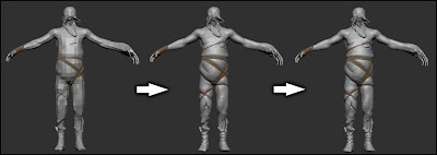
The different subdivision levels in z-brush. (Click to enlarge.)
When the sculpting was done the lowest subdivision level was exported in obj-format to use as a starting point for the final low-polygon in-game mesh. The reason to make a new low polygon mesh and not use the mesh from sculpting is to optimize the number of polygons in the final mesh. This can be very important for performance when added in the game. The mesh used as a base when sculpting has a a relatively uniform tessellation (distribution and a size of polygons) and mostly a quad layout of the geometry (meaning that most polygons are four sided). The in-game mesh then had to be modified to only have geometry where it was needed. By doing this, more details could be added where really needed without decreasing any performance of the final mesh. This process is sometimes called retopologizing and can be done several different ways. Some people like to use the specialized retopologizing tools within Zbrush, but I personally like to use the regular modeling tools in my 3d software.
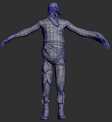
The final version of the low polygon mesh. (Click to enlarge.)
When the modeling was done it was time to create the uv-map. A uv-map is basically a way to show where parts of model belong on a flat surface, the texture. This is called a projection, and in this case a 3D to 2D one (the model is in 3D and the texture 2D). Unless the 3D object is a very simple one (like cube or plane) this is a very tricky operation and it is almost impossible to maintain the same ratios as on the model. A good example of this is to look at the various ways our planet earth (a 3D object) has turned into maps (a 2D surface) and all of the distortions and/or strange layouts that follow.
There are some conventions that should be followed when laying out this uv-map. The most important is probably to make sure to put seams (places where polygons split up during the 3d to 2d projection) in places where they are not very visible. This since it is often very hard to match up colors of pieces not next to one another on the texture. Seams can also mess up shading when using normal maps. On a humanoid character a good place to put them could be on the inside of the arms and legs for example. This character also have some irregular areas that have to be given some extra thought. For example the head had an unusual shape making the uv-mapping extra tricky. Once the placement of seams in the uv-map have been established the chunks where laid out to maximize the use of the texture space.
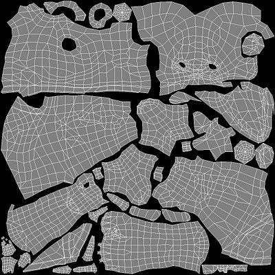
The uv-map layout. (Click to enlarge.)
Before starting the actual texturing work I generated colors for some of the texture maps from information in the high poly mesh. The textures produced this way were the normal map and an ambient occlusion (AO) map. The normal map gives the mesh some extra detail and makes it seem like it is made up from more polygons than it really is. The AO map was to be blended into the diffuse (the base color) texture to give a greater sense of detail and form. Basically, AO is a calculation of how much light reach each point on the mesh, making creases darker and pointy details brighter.
The diffuse map represent the base color of the character and was created in Photoshop by using a mix of various photos, custom Photoshop brushes and the previously mentioned AO map. The diffuse map was extra important as it was also used as a base for creating some other maps like the specular and gloss map. These two are black and white maps that control how light will affect the model. Specular determines the strength of shininess on an areas and gloss how sharp the shininess is. Some of the detail in the diffuse was also used to add extra details in the normal map, like wrinkles and scars.

The final normal, diffuse, specular and gloss maps. Notice that all use the uv-map layout as base. (Click to enlarge.)
Once the texture was completed, the model was ready to be used in-game!

Renderings of final model using different setups of texture maps. (Click to enlarge.)
It's Alive!
By Thomas Grip (Frictional Games)
Before the model could be used in game, some other things was required. First the model needed to be rigged and skinned, a process where the mesh is connected to a skeleton. This skeleton then need to get animations and not until that was done where we able to get a it into the game. This job was made in part internally and partly by an external company. There were a lot of job put into this, but is unfortunately outside of the scope of the article. To some sum things up: we got the creature moving and it was now time to put inside the game.
For Amnesia: The Dark Descent we use a proprietary engine called HPL2 which is a vastly improved and revised version of the engine that powered the Penumbra games (although quite old now as we are developing version 3 of the engine for our upcoming game). It uses a rendering algorithm called deferred shading at its core, a technique that is very useful when rendering lots of lights. It works by drawing out the the normals, depth, specular and diffuse colors to separate buffers and then use these to calculate the final color of a light. Normally when drawing a light, all models that intersect with the light needs to be found and then redrawn based on the light's properties. The nice thing about deferred shading is that models are only need to be drawn once, saving tons of rendering time and allowing more predictable frame rate.
Amnesia: The Dark Descent can be a quite dark game in places, sometimes making it hard to see enemies properly. To remedy this we added a rim lighting algorithm that made the creature's outline light up when in dark areas. This proved extremely moody and when walking in dark passages the player could suddenly get a glimpse of disturbing silhouette slouching off in the distant. After this final touch, our creature was ready to frighten unknowing players!
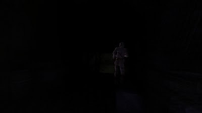
In-game screenshot showing of the rim-lighting on the creature. (Click to enlarge.)
Hopefully this article will give you some insight into the work that it took to create an enemy for our game. It was quite a long process and took several months from idea to finished asset but we think the final result is well worth it!
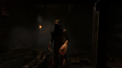
An in-game screenshot of the final rigged model in a scene. (Click to enlarge.)

Thanks for these posts! I always find it interesting to see how developers make their games.
ReplyDeletevery nice work you did here :)
ReplyDeleteThanks so very much for these articles. It's fascinating to see how you made these nightmarish things. When I played through Amnesia, I was much more focused on running for my life while trying not to wet myself than I was about actually getting a good look at the creatures. They are masterfully terrifying. Amnesia was my indie GOTY.
ReplyDeleteBy far the best posts so far. I myself am actually in training to become a game concept artist/ modeller and I very much hope that sometime in the future I may even be working on one of your games! I found Jonas Steinick Berlin's work in particular to be very interesting. I have never before seen such unusual monsters for games, and their backstory is really disturbing :D When I was playing the game the first time I analysed the notes and diaries as best I could to try and work out as much of the story as possible. I must be playing it for the sixth time now, and if it wasn't for this post I still wouldn't have a clue as to where the monsters came from!!
ReplyDeleteAmazing work!! Very well done i hope to hear more games from use ur NUMBER #1 FANN WOOP WOOP =D
ReplyDeleteGREAT !!
ReplyDeleteAlso: Will you be posting anything about the development of the environments or other characters? It's really interesting to read about your design process :)
ReplyDeleteDan Peacock,
ReplyDeleteIt is nothing we have in the pipes, but that if might be a nice thing to do. There are some levels (like the cistern) that has quite a bit of back story. Will see if the other people involved are up for it, and if so, perhaps something like that will come.
I've always wondered how a texture is applied to complicated model shapes. Thank you for sharing!
ReplyDeleteI never really got a good look at this monster until I encountered it in the guest room, and found its face highly disturbing!
Great! Thank you! :D
ReplyDeleteI noticed earlier, while playing with the HPL2 model viewer, how the grunt monster's head looks a bit lake Abe from Oddworld when viewed from above. Except for the fish eyes, LOL.
ReplyDelete@Thomas:
Long time no see since the "Dragon Speech" post, you guys had me worried... :D
Since you (the developers) are the only ones that can answer this question, and it appears that it's kind of hard to get your attention on the forums, I'll ask it here:
There are certain aspects of your tool suite that are still undocumented, which creates a problem when it comes to its usability. For example, some of the editors generate XML files that store the _absolute path_ - you can see how this can be a problem for deployment.
The question is, what would make the editor behave this way? Is it a configuration problem? Are the editors released the only custom-made tools you used for the game? Also, the model editor often behaves strange when it comes to materials, in a way that can't be understood without some reference material.
Anyway, thanks for any kind of answer, I'd really like to be able to make something non-trivial with the editors.
The previous is basically a recap of a thread I started, where you can find more details (the link is below.) Please excuse my frustrated tone there :D
http://www.frictionalgames.com/forum/thread-6788.html
P.S. And why not all of those tools can't have their window sizes configured, for the love of God?
Completely amazing!
ReplyDeleteI'd love to hear more about how you incorporated object-based rim lighting into your deferred pipeline. Did you have an object-id buffer, or was it more of an edge detection type thing? Or maybe you just messed with some values in the g-buffer so that the rims got lit properly?
ReplyDeleteI actually just added it by drawing the enemy a second time with additive rim lighting. Since this is done on so few parts of the screen it did not really affect frame rate.
ReplyDeleteAHHH! It's coming straight for me! *Hides in closest wardrobe*
ReplyDeleteKeep up the great effort you're putting towards these games, and all the information which is posted here. I for one am looking forward to your next hair-raising release.
Ah can't believe I missed this post until now! I have similar aspirations as Dan Peacock, and a few questions for Olof Strand about the zbrush part of the deisgn if he is around and feels like answering?
ReplyDelete1) Did you use zbrush, maybe even UV master plugin to do the UV map using the protect / attract seams tools, or some other method?
2) Was using photoshop to create the diffuse map for the creature personal preference over using Polypaint + spotlight in Zbrush? I Haven't done work this complex yet but I would imagine spotlight would be easier than using photoshop for this task?
Anyway thanks for these articles, I love learning about these things.
Well it certainly scared the crap out of me! Great job guys, just finished the game today! Good luck with your next project!
ReplyDeleteTake all my money please. Right now. All of it.
ReplyDeleteVery very intresting indeed my focus in the game was trying to finish the game as soon as possible I swear I had many heart attacks but you people make such disturbing things it isnt cliche because it shows that we humans are only afraid of ourselves and what we can do when we are not aware.keeping our sanity and Humanity is the only thing keeping our world from coming to this. This game did not only disturbed me it went further by making me feel more. You people at friction games deserve a nobel prize for making people sane by making them near insane. Thank you
ReplyDeleteBy the way please make an article on how the brutes were made
ReplyDelete