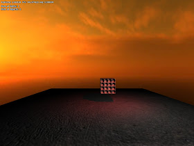
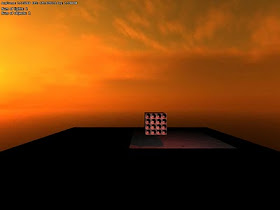
When placing lights in some rooms, it is common that light bleeds through walls, and show up in other rooms close by. The obvious way to fix this is to add shadows, but shadows can be pretty expensive (especially for point lights), so it is not often a viable solution. In Amnesia we solved this through careful placement, yet bleeding can be seen in some places.
To fix this I added a new feature that is able to limit the lights range with a box. This way the light can cast light as normal but is cut off before reaching an adjacent area. This pretty much does the job of shadows, but is much cheaper.
It turned out to be pretty simple to implement as well. In the renderer, different geometrical shapes are used to render lights (spheres for point lights and pyramids for spots) which make sure the light only affects needed pixels. To implement the masking, these shapes where simply exchanged for a box and then with some small shader changes it all worked.
Without masking:

With mask:


So long as you don't have to do this for every light source but only when it shines in unwanted places.
ReplyDeleteIt would allow for some nice lighting effects as well.
Cool stuff would be a nice thing to play with.
A nice solution. So theoretically, that means you can disregard more objects when drawing shadows, accelerating that process too, if you don't need to worry about light bleeding through walls anymore... Right?
ReplyDeleteNice job.
Marcus:
ReplyDeleteUsing this to dynamically cull shadow casting objects might be a bit tricky and is nothing I a currently doing. However, it could be used to turn off shadow casting of objects that might have needed it to, so valid point! :)
Interesting, but wouldn't it stop light moving through a doorway?
ReplyDeleteIs this coming from Anton Kaplanyan's Siggraph Talk? If not, you might want to look at his bit on light clipping volumes, it sounds very similar to what you're doing.
ReplyDelete"Is this coming from Anton Kaplanyan's Siggraph Talk?"
ReplyDeleteYeah read that. I already use the same kind of stencil test for lights so it was just a matter of changing the shape! What I could do is to combine light and box shape when filling the stencil, but I skipped that since it did not seem necessary (the box is almost always inside the light shape it clips). Might change when using it a bit though.
Great page btw! Cryteks presentations are generally great so nice to see them collected. I a few there I have not read.
segmentedreality:
ReplyDeleteIt is intended for static lights, but it actually works on moving too. The light mask is independent of the light so if the point light is something like a swinging light bulb, the light will move but still be clipped inside the same box volume.
Also mentioned in "Battletested Deferred Rendering" ( http://www.gdcvault.com/play/10111/Battle-Tested-Deferred-Rendering-on ), using general geometry for light-clipping-volumes.
ReplyDeletePretty cool idea to solve that problem. Only problem are probably rooms with another shape than a box or circle, as the implementation of more complex shapes would most probably not have much advantages over real shadows anymore. But as this solves the general case, I guess it is a very usefull addition.
ReplyDeleteRegarding "Battletested Deferred Rendering":
ReplyDeleteHave not seen this so thanks a bunch! Really interesting to see how others do the G-buffer and it is fit into the console hardware. Just quickly looked through but they seem to have some interesting stuff.
Nils:
Most cases, there is a space between a the current and any adjacent rooms so not having an exact shape is normally not an issue. Also, this mostly happens is corners or along walls as bleeding lights do not cover entire rooms.
That said, using other shapes is real easy rendering wise. I am already using a cube mesh for the box masking, so it is just a matter of changing that. The problem is that it is complicated to do in the editor, so gonna stay away from that if possible.
Nice and useful.
ReplyDeleteA thing about ambient lighting via "box lights" in your engine: I hate that the transitions from one ambient light to the next are sharp. A perfect solution would be for each box to have a transition area from the "outside ambient" to the "inside ambient". Pixel/fragment shaders should make implementing that relatively easy. Or it can be faked - just use the object's pivot to determine the ambient color for the whole object - as long as there is a gradual transition when moving from one area to the next.
Another way to make it even simpler is to use the Half-Life 2 approach: (as far as I can tell) the game just detects if an abject enters a box that defines a certain ambient and blends the new color over time. This of course means that they use a different lighting model for the environment, but you get my point.
Any of these approaches shouldn't be to expensive, right?
Regarding lightboxes:
ReplyDeleteLast time I checked into it, doing a drop-off would seemed to expensive. Might give it another check though. In Amnesia we managed to use the sharp box light without any real artifacts though and there was never any greater need of smoother transition.
Perhaps adding will make the boxlight usuage better though, so have not given it up :)
The half-life approach would not work in a deferred shading approach, lighting on an object basis is not possible. Interestingly, the thing you describe is very similar to what we used in Penumbra Black Plague.
Lightboxes:
ReplyDelete"In Amnesia we managed to use the sharp box light without any real artifacts though and there was never any greater need of smoother transition."
True, but this was achieved via clever level design, and aided by the fact that most of the time Daniel's model was not visible (it can typically be seen when the lantern is on; most players tend to use it as rarely as possible, though). When the hand model _is_ visible, Daniel moves fast enough so that the change of ambient lighting seems instantaneous, but you can still position Daniel in such way that the intersection with the box' side is clearly visible.
It would be great if that could go away.
Anyway, what approach(es) you have in mind (or have tried)? If you feel that this is not the right place to dump a bunch of equations, maybe you can point out a site or a paper that describes the approach(es)?
The thing is, smooth ambient could be used for interesting and creative atmospheric effects, in the level design process - and considering your approach to game dev, it would definitively be a plus.
You could alternatively provide a second type of light - spherical ambient, or something like that, for specific purposes (outdoor environment effects especially): I guess a sphere would simplify most of the calculations?
Anonymous:
ReplyDeleteI have not looked into it that much, but the idea would be to have a distance to edge, which can be made by checking each axis (x, y and z) of the lit pixel against each side of the box, finding the shortest and then plugging that into a normal attenuation algorithm. This would be 3x6 checks and it did not feel trivial so I simply skipped it. But as I said I might look into.
All games comes with dirty tricks, that is just the way it is :) But of course, one wants to reduce these.
Regarding outdoor lighting, that is taken care of:
ReplyDeletehttp://frictionalgames.blogspot.com/2010/10/tech-feature-sunlight-with-shadows.html
Talking about dirty rendering tricks: what about using a rectangular falloff texture: white in the inner region, and gradually fading to black towards the edges? Then just align the coordinate system to the box and transform so that the box space spans 1 unit across, and you can sample from the texture directly. Some programing or texture blending tricks would be required to make it work in 3D, but in theory you could use just that one texture for all sides, and for all light boxes in the level.
ReplyDeleteSure, it would stretch with the box, but hey, what to heck, as long as the transition is gradual.
I don't know, maybe I'm wrong.
Anyway, I can't wait to see what vistas will the next iteration of HPL bring, keep up the good work.
BTW, since you want your next game to exhibit more outdoor environments, I'd like to share what I learned from playing Crysis, and before that Far Cry (yeah, I 'analyze' while I play - can't help it...):
- realistic terrain should be based on real world references, terrain-related props among other things - to many games have generic round rocks and boulders, but there's just no such things in nature. Rocks have structure, and both the model's shape and texture should work together to make it look good - so, plan carefully.
Rocks with generic "crumple" texture never look right - in reality, there are layers, cracks, fault surfaces - a "high pass" shape behind all the irregularity.
- realistic vegetation is of mayor importance, but the key is to make the models more or less follow the natural surfaces formed by the configuration of the leaves - they are generally 'setup' to receive the maximum amount of sunlight.
- real world references are the key: in Crysis, as you approach the alien mountain, you come across a rip/crack in the terrain, and you can actually see the roots of trees and other vegetation protruding, and the whole scene was so lifelike in general. I thought it was brilliant.
It looks like the end outcome is going to be awesome.
ReplyDelete