Friday, 10 December 2010

Player - Avatar Symbiosis

In a recently released paper, Jeroen D. Stout (creator of Dinner Date) proposes an interesting theory on the relashionship between player and avatar. It is related to the things that have been discussed previous post about immersion, so I felt it was relevant to bring it up. The full paper can be gotten from here. I will summarize the ideas a bit below, but I still suggest all to read the actual paper for more info!

Most modern theorists of the mind agree that it is not single thing, but a collection of processes working in unison. What this means is that there is no exact place where everything comes together, but instead the interaction between many sub-systems give rise to what we call consciousness. The most clear evidence of this is in split brain patients, where the two brain-halves pretty much form two different personalities when unable to communicate.

This image of a self is a not fixed thing though and it is possible to change. When using a tool for a while it often begins to feel like an extension of ourself, thus changing ones body image. We go from being "just me" to be being "me with hammer". When the hammer is put down, we return to the old previous body image of just being "me". I have described an even clearer example of this in a previous post, where a subject perceives a sense of touch as located at a rubber hand. Research have shown that this sort of connection can get quite strong. If one threatens to drop a heavy weight or similar on the artificial body part (eg the rubber hand), then the body reacts just like it would to any actual body part.

What this means for games is that it is theoretically possible for the player form a very strong bond with the avatar, and in a sense become the avatar. I discuss something similar in this blog post. What Jeroen now purposes is that one can go one step further and make the avatar autonomously behave in a way that the players will interpret has their own will. This is what he calls symbiosis. Instead of just extending the body-image, it is the extension of the mind. Quite literally, a high level of symbiosis means that part of your mind will reside in the avatar.

A simple example would be that if player pushes a button, making the avatar jump, players feel as if they did the jumping themselves. I believe that this sort of symbiosis already happens in some games, especially noticeable when the avatar does not directly jump but has some kind of animation first. When the player-avatar symbiosis is strong this sort of animation does not feel like some kind of cut scene, but as a willed action. Symbiosis does not have to be just about simple actions like jumping though, but can be more complex actions, eg. assembling something, and actions that are not even initiated by the player, eg. picking up an object as the player pass by it. If symbiosis is strong then the player should feel that "I did that" and not "the avatar did that" in the previous examples. The big question is now how far we can go with this, and Jeroen suggests some directions on how to research this further.

Having more knowledge on symbiosis would be very useful to make the player feel immersed in games. It can also help solving the problem of inaccurate input. Instead of doing it the Trespasser way and add fine-control for every needed body joint, focus can lie on increasing the symbiosis and thus allowing simply (or even no!) input be seen by players as their own actions. This would make players feel as part of a virtual world without resorting to full-body exo-skeletons or similar for input. Another interesting aspect of exploring this further is that it can perhaps tell us something about our own mind. Using games to dig deeper into subjects like free will and consciousness is something I feel is incredibly exciting.


Thursday, 2 December 2010

Tech feature: Light Masking

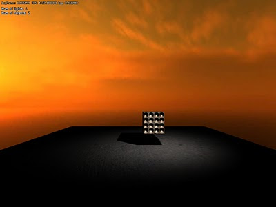
So just wanted to give a quick info on a brand new feature: light box masks.

When placing lights in some rooms, it is common that light bleeds through walls, and show up in other rooms close by. The obvious way to fix this is to add shadows, but shadows can be pretty expensive (especially for point lights), so it is not often a viable solution. In Amnesia we solved this through careful placement, yet bleeding can be seen in some places.

To fix this I added a new feature that is able to limit the lights range with a box. This way the light can cast light as normal but is cut off before reaching an adjacent area. This pretty much does the job of shadows, but is much cheaper.

It turned out to be pretty simple to implement as well. In the renderer, different geometrical shapes are used to render lights (spheres for point lights and pyramids for spots) which make sure the light only affects needed pixels. To implement the masking, these shapes where simply exchanged for a box and then with some small shader changes it all worked.

Without masking:

With mask:


Wednesday, 1 December 2010

Bye, bye Pre-Pass lighting

I have an announcement to make.

I am dumping pre-pass lighting.

A couple of weeks ago I started to remaking the renderer from a deferred shader to a pre-pass lighting one. Directly after implementing it, I wrote this post. At first, pre-pass lighting sounded great: faster light rendering and more variation in materials. Having seen that companies such as Crytek and Insomniac Games used it, I thought it would be the next logical step to take.

However, even as implemented it, the problems began. The first one was that specular lighting has to be made through hacks or something that makes it closer to deferred lighting. The next was that implementation become more messy. I suddenly needed to redraw all objects in two separate passes and this made the material and shader code harder to maintain. Normal deferred shading has this nice design where all material info is rendered in one pass to one buffer. But in pre-pass lighting, this spread out and makes more annoying to add new stuff and to update existing.

Still, I stuck to it, because I was sure that the speed and material variety would make up for it. One of the features I was looking forward to was making more interesting decals, with normals and such. Since only the light data is written to an accumulation buffer I thought this would allow me to easily put more effects to the decals. However, I quickly realized that I had been quite foolish and not considered that pretty much every interesting part of a materials is added when lighting it. The surface normals, specular, etc are all baked into the light data. So I ended up doing tricks that I could actually work with normal deferred shading.

So what ended up with was lighting of worse quality, compared deferred shading, and with no more room for special effects. Still, this rendering is much faster right? Well, I did some checks which I collected in this post. It turns out that pre-pass is actually slower unless in very specific situations. None of the improvements I was hoping for turned out to be true.

Still, I stuck to it. I am not sure why, but I guess I did not want to face the truth after having put so much time and effort into it. Going back to the old renderer was something I did not want to consider.

Then last week, as I was starting making undergrowth for the terrain, it suddenly happened. I realized that I had to render the vegetation twice, creating more overdraw and making it a lot more cumbersome to implement. At this point I decided that I should seriously consider going back to the old deferred renderer. What I was most worried about about was that it would exclude us from consoles, but I found out that games like Burnout Paradise used a deferred shader too, and assuring me that consoles would still be possible to do.

This post by Adrian Stone, with an in-depth discussion on the subject, sealed the deal for me and I got to work with going back to deferred shading. I had actually come across Adrian's post before when implemented pre-pass lighting, but never read it carefully. I guess it would not had made me stop then since I wanted to check it out myself, but it is interesting to see how one can convince oneself that something is correct, to the point of avoid contradictory sources. This is a very important lesson to learn and one should always be prepared to reconsider and "kill your darlings".

Right now I have fully implemented the deferred shader again and even updated it a bit too. For one thing, I fixed so the decals support all the feature I had in the pre-pass lighting shader. Since we are aiming for a little higher specs (shader model 3 or 4) for our next game, I took that into account and was able to add some other fun stuff. Examples are colored specular and saving the emission in the g-buffer (allowing to cheaply to a variety of effects).

I am really happy to back to the old renderer and now that I am adding new features things are going a lot smoother. The pre-pass renderer was not all in vain though. I cleaned up the rendering code a lot and it also made me rethink how some features could be added. Last but not least, it also reminded me that I should never get too attached to an idea.


Wednesday, 24 November 2010

Tech Feature: Terrain textures

I have finally finished the part of the terrain rendering that I spent most time researching and thinking about: texturing. This is a quite big problem, with many methods available, each having its own pros and cons.

I was looking for something that gave a lot of freedom for the artists, that was fast and that allowed that the same algorithm could be used in both game and editor. The last point was especially important since we had much success with our WYSIWYG-editor for Amnesia, and we did not want terrain to break this by requiring some complicated creation process.

Even once I started working on the textures, I was unsure on the exact approach to take. I had at least decided to use some form of texture splatting as the base. However there is a lot of ways to go about this, the two major directions being to either do it all in real-time or to rendering to cache textures in some manner.

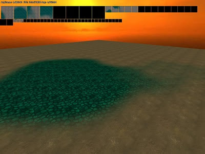
Before doing any proper work on the texturing algorithm I wanted to see how the texturing looked on some test terrain. In the image below I am simply project a tiling texture along the y-axis.


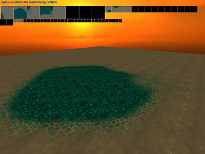
Although I had checked other games, I was not sure how good this the y-axis projection would look. What I was worried of was that there would be a lot of stretching at slopes. It turned out that it was not that bad though and the worst case looks something like this:

While visible it was not as bad as I first thought it would be. Seeing this made me more confident that I could project along the y-axis for all textures, something that allowed for the cached texture approach. If I did all blending in real-time I would have been able to have a special uv-mapping for slopes, but now that y-axis projection worked, this was no longer essential. However, before I could start on testing texture caching, I need to implement the blending.

The plain-vanilla way to do is, is to have an alpha texture for each texture layer and then draw one texture layer after another. Instead of having many render passes, I wanted to do as much blending in a single draw call. By using a an RGBA texture for the alpha I could do a maximum of 4 at the same time. I first considered this, but then I saw a paper by Martin Mittring from Crytek called "Advanced virtual texture topics" where an interesting approach was suggested. By using an RGB texture up to 8 textures could be blended, by letting each corner of an rbg-cube be a texture. A problem with this approach is that each texture can only be nicely blended with 3 other corners (textures), restricting artists a bit. See below how texture layers are connected (a quick sketch by me):

Side note: Yes, it would be possible to use an RGBA texture with this technique and let the corners of a hyper cube represent all of the textures. This would allow each texture type to have 4 textures it could blend with and a maximum of 16 texture layers. However, it would make life quite hard for artists when having to think in 4D...

When implemented it looks like this (note he rgb texture in the upper right corner):


However, I got into a few problems with this approach, that I first thought where graphics card problems, but later turned out to be my fault. During this I switch to using several layers of RGBA textures instead, blending 4 textures at each pass. When I discovered that is was my own error (doh!), I had already decided on using cache textures (more on that in a jiffy), which put less focus on render speed of the blending. Also this approach seemed nicer for artists. So I decided on a pretty much plain-vanilla approach, meaning some work in vain, but perhaps I can have use for it later on instead.

Now for texture caching. This method basically works as the mega texture method using in Quake Wars and others. But instead of loading pieces of a gigantic texture at run-time, pieces of the gigantic texture is generated at run-time. To do this I have a several render textures in memory that are updated with the content depending on what is in view. Also, depending on the geometry LOD I use, I vary the texture resolution rendered to and make it cover a larger area. So texture close to the view use large textures and far away have much lower.

I first thought had to do some special fading between the levels and was a bit concerned on how to do this. However, it turned out that this was taken care of the trilinear texture filtering quite nicely (especially when generating mipmaps for each rendered texture). When implemented the algorithm proved very fast as the texture does not have to be updated very often and I got very high levels of detail in the terrain.

Side note: The algorithm is actually used in Halo Wars and is mentioned in a nice lecture that you can see here. Seeing this also made me confident that it was a viable approach.

The algorithm was not without problems though, for example the filtering between patches (different texture caches) created seams, as can be seen below:

(click to enlarge, else it will not be seen)

The way I fixed this was simply to let each texture have a border that mimicked all of the surrounding textures. While the idea was simple, it was actually non-trivial to implement. For example, I started out with a 1 pixel border, but had to have a 8 pixel border for the highest 1024x1024 textures to be able to shrink it. Anyhow, I did get it working, making it look like this:

(Again, click image to see full size!)

Next up was improving the blending. The normal blending for texture splatting can be quite boring and instead of just using a linear blend I wanted to spice it up a bit. I found a very nice technique for this on Max McGuire's blog, which you can see here. Basically each material gets an alpha that determines how fast each part of it fades. The algorithm I ended up with was a bit different from the one outlined in Max's blog and looks like this:

final_alpha = clamp( (dissolve_alpha- (1.0 - blend_alpha ) / (dissolve_alpha * (1-fade_start), 0.0, 1.0);

Where final_alpha is used to blend the color for a texture and fade_start determines at which alpha value the fade starts (this allows the texture to disappear piece by piece). blend_alpha is gotten from the blend texture, and dissolve_alpha is in the texture, telling when parts of the texture fades out.

So instead of having to have blending like this:


It can look like this:


Now next step for me was to allow just not diffuse textures, but also normal mapping and specular. This was done by simply rendering to more render targets, so each type had a separate texture. This would not have been possible to do if I had blended in real-time as I would have reached the normal limit of 16 texture limits quite fast. But now I rendered them separately, and when rendering the final real-time texture I only need to use a texture for each type (taken from the cache textures). Here is how all this combined look:

You can see small version of each cache texture at the top.

Now for a final thing. Since the texture cached are not rendered very often I can do quite a lot of heavy stuff in them. And one thing I was sure we needed was decals. What I did was simply to render a lot of quads to the textures which are blended with the existing texture. This can be used to add all sorts of extra detail to map and almost require no extra power. Here is an example:


I am pretty happy with these features for now although there are some stuff to add. One thing I need to do is some kind of real-time conversion to DXT texture for the caches. This would save quite a lot of memory (4 - 8 times less would be used by terrain) and this would also speed up rendering. Another thing I want to investigate is to add shadows, SSAO and other effects when rendering each cache texture. Added to this are also some bad visual popping when levels are changed (this only happens when zooming out a steep angle though) that I probably need to fix later on.

Now my next task will be to add generated undergrowth! So expect to see some swaying grass in the next tech feature!


Monday, 22 November 2010

How the player becomes the protagonist

Introduction
In Amnesia one of the main goals was for the player to become the protagonist. We wanted the player to think "I am" instead of "Daniel is" and in that way make it a very personal experience. The main motivation for this was of course to make the game scary, but also for the memories that were revealed to feel more personal for the player.

In this post I will go through some of the design thinking we used, problems it caused and how it eventually turned out. I will also briefly discuss the future of this sort of design.


Playing a role
First of all, it is not required that the protagonist matches the player character in order for the player to "become" him/her. As an extreme example, I see no problem with a game featuring an animal as lead character to have the player become the protagonist. The idea is not that the player should match the physical / mental protagonist, but rather that he/she should be able to roleplay him/her and to feel like really being him/her.

There is of course limits to this kind of roleplaying and certain characteristics might make it impossible for a player to feel a connection. This is the same for works in other media where the reader/viewer is meant to feel empathy toward one or more characters. Sometimes there is some mismatch that removes this feeling, and much of the work's power is lost. Note that this sort of friction is more likely to happen because of the personality of the character and not so much because the physical appearance. A simple example of this would be that protagonists in Disney movies are often very easy to relate to despite being animals.

Considering this, the general rule that we used was not to force emotions and actions that players were unlikely to accept. When the protagonist is displayed as doing or feeling something, we had to make sure that player could agree to this.


Getting into the act
In film or literature it is possible for the audience to not like the protagonist at the start, but then make them feel a connection over the course of the work. This is not possible to do in a videogame, as players must start acting out their role as soon as the game starts. If the situation does not feel comfortable at the start, then it will be very hard to connect.

Because of this, videogames need to have a tutorial of some sort where the player gets used to the idea of playing a certain character. During this phase it is also important that the player learns how to act as the protagonist, so they later act accordingly. I do not think this can be done solely on a mechanics basis, as the trial and error involved will most likely just frustrate. This is largely dependent on the space of actions available though and sometimes players will quickly realize the role they are meant to play.

In Amnesia we made the choice to be very upfront on what is expected by the player. This is accomplished by displaying messages before the game starts, telling the player what to do. The main message was a rather simple one, simply saying that the player should not try and fight any monsters. As this is pretty close to what most people would do in real-life, we basically just had to tell players that the game was not a first-person-shooter and the rest came naturally. If the game would have required more specific behavior from the player, more info might have been needed.

Once the player accepts this role and is ready to play, the next step is to provide an interface between the player and world. Here a bunch of problems arises and it becomes less clear what is the right thing to do.


What emotions to hide?
First of all, we decided to remove any form of cut-scene from the game. Upon entering a cut-scene, there is a large distinction between the kind of control a player has during normal play, creating a discrepancy that weakens the player-protagonist connection. In our previous effort, Penumbra, we had little of these, but there were still places when control was taken from the player for longer periods. In Amnesia, we only used very short "view hijacks" to display points of interest. These were not very frequent and were meant to be seen as reflexes, which seemed to be accepted for most players. Some were a bit annoyed by them though and we are not sure they were that necessary.

Next thing we decided on was that, unlike Penumbra, Daniel (the protagonist) should never comment on the situation. In Penumbra the most obvious place this happens is when a spider is spotted and the text "A spider! I do not like spiders" appear. This sort of interface where the protagonist make subjective remarks on the game world can very easily break the connection between player-and-protagonist.

We tried to skip descriptive texts completely, but this caused problems when dealing with puzzles. If players start thinking about a puzzle "incorrectly", then it is imperative that they get on the right track. In these cases, the easiest (and many times only) way to communicate this to the player is by using texts. We tried to add as many solutions to avoid having texts, but it only works so far, and eventually some kind of explanatory / hinting text was needed. If not the player would have gotten stuck instead and we thought this would be worse than having the texts. In order to keep the player-protagonist connection, we kept all of this texts very objective and impersonal, careful to not force emotions on the player.

Side note: A problem we had when removing subjective comments was the hints were much harder to write. Not being able to let the protagonist guess, use insights or personal knowledge proved quite tricky at times.

We did not remove all of the subjective protagonist emotions though. We kept the more autonomous physical actions such as panting and heart beats, a choice that proved slightly controversial. After releasing the teaser video some people argued that having these sort of reactions pulled them out of the experience. Others felt that it just heightened the experience. Once the game was released, the main complaint came at a very specific feature, namely the "sanity damage"-reaction (that happens whenever the player witnesses something frightening). In the end, we estimate that something like 15-30% of the players disliked these kind of effects.

For the people that did not dislike these effects, many felt it increased the connection to the protagonist. For example feeling as if their own heart beat faster when the protagonist's did or becoming startled when a "sanity damage"-effect told them to. This is a really interesting subject and while using these kind of effects might detract the experience for some, I think it might be worth taking the risk. So far we have mostly tried this for very simple situations, but I believe it can used to evoke much more complex emotions.


Bringing back memories
An important part of Amnesia is that players slowly learn the background of the character they are playing. As the name suggest, the game starts out with the protagonist having amnesia that sets the player and protagonist on equal footing. By progressing through the game both the player and the protagonist gain access to increasingly more lost memories, slowly getting an idea of how Daniel ended up in the situation he currently is in.

The main mechanic we used to deliver these lost memories was through diary entries scattered throughout the game. We decided to voice these in order for them to be more interesting, but I think this backfired a bit. What many players seem to have experienced was that Daniel was reading the entries aloud. Thus this proved to be a large distraction and must have weakened the player-protagonist bond for many. What we intended was for the player to hear Daniel's voice as the voice of their old self. This was probably way too obscure though and it might have been better to just had them as pure text.

Added to this was the fact that Daniel actually spoke at some points. Some lines are spoken during the start of the game and some during gameplay if sanity is too low. Again, this was intended to be lost memories, but many players did not perceive it as such and instead thought it was strange to hear Daniel talking.

As mentioned earlier, we wanted the player to feel as if the lost memories were their own. But because of the way the memory content was delivered I think the effect was not what it could have been.


Dialog
A major obstacle when trying to create strong a player-protagonist connection is that one often end up with the so called "silent protagonist". The reason for this is simply that that whenever spoken words are required, the lines spoken by the protagonist must be predetermined and chosen for the player. Either, the character simply speaks a scripted line or the player chooses from a list canned responses. Using the first type allows for more fluent conversation but removes any interaction. The second choice provides some interaction but makes conversations stiff (as other actions are only possible when in "dialog mode") and might lack options the player finds appropriate to say. Some hybrid solutions exist (like in Blade Runner where the player just sets an attitude) but the problem still remains.

Side note: Interestingly, the problem is quite opposite in Interactive Fiction. Instead of lacking options for the player, the characters one speaks to lack the intelligence to understand all possible (and fitting) sentences.

So how to solve this? Well, first of all it is worth noting that the systems mentioned above can still be used if applied carefully. If the player's emotions are in line with the protagonist's then simply having short scripted lines could work very fine. To make this work I also think it is important that the protagonist's voice is a recurring element of the game to get the player used to it. If it just pops up on rare occasions, the illusion is easily broken. Call of Cthulhu and the Thief series use this to some success (I think it is at its best when short, in-game and the player is free to do other actions at the same time).

The multiple choice system is also possible to use, but I think it comes with more problems. The biggest is that since the player gets a choice it is more obvious when the game does supply the wanted action. With other actions such as walking and fighting, it is easier to set up rules for the player on what is allowed and not. Conversations have a much wider scope and it is much harder to keep it consistent. It is also much harder to display the options in a way that feels okay. Unless they entire game is controlled with a menu-like system, having a menu pop up for a specific action is very distracting.

In Amnesia we chose to avoid conversations as much as possible and there are only two occasions when you meet another character face-to-face. And in only one of these were there any real opportunity for a conversation (with a tortured man called Agrippa). The way we went about it was for Daniel to be silent, but for Agrippa to respond as if Daniel had spoken. This gave the dialogs (or rather monologue) more flow but many players found this quite disconnecting. They found it strange that Daniel silently spoke back, especially as many was sure they had heard him speak before when reading diaries. On the other hand, it might have been even more strange if Agrippa had never asked Daniel anything and simply just spoken in direct orders or in a lecturing manner. Agrippa was put into game pretty late in development and we did not gave it as much thought as we should have, so this might have been solved better.

When creating a videogame with a strong player-protagonist connection, the best option is probably to fit the game world around a protagonist that does not require none or very simple (as in yes-no or simple vocabulary) speech. This way, the player-protagonist connections is more easily kept and consistency is maintained. An example of this is System shock where all characters are dead or talking through a one-way radio. Another example is BioShock 2 where the protagonist is a dumb robot that is not expected to speak. This of course put limits on what kind of experiences that can be made, but might be the only way to create a strong player-protagonist experience.


Problems to overcome
It is not only dialog that is a large problem when trying to make player and protagonist one and the same. Since we are trying to craft an experience where the players themselves are a central ingredient, much pressure is put on them.

A major problem is that it is hard to let the protagonist have any special knowledge. This is a reason why stories starring amnesiacs, outsiders or cannon-fodder are so common; things becomes very complicated if players need to have a deeper understanding of their surroundings. A way to solve this is to force the player into learning things before starting the game. But since reading a novel before starting the game is not really possible, the amount of information that can be given is quite limited. Another way to solve this is to have some sort of tutorial texts popping up, but this is of course very distracting.

Another issue, is that the player and protagonist might not share the same goals. For instance the protagonist might be out for revenge, but the player might not be interested in this. This makes games of this type end up with fairly simplistic motivations. It might be possible to give some kind of instructions before the game starts, but that does not seem very good to me. Better would be to provide an experience at start that sets up the player's mood to match the protagonist's. This is easier said than done though.


Why bother?
So why go into all of this trouble of making blurring the line between player and protagonist? For one thing, I think it is something that is extremely interesting to explore. So far games that try to create strong player-protagonist bonds are mostly about killings things and exploration into other themes is pretty much uncharted.

Secondly, it is something that that is unique to the medium. In no other media can the audience step into works of art themselves. And just because of this I think it demands to be experimented with. Instead of looking too much to film or other art as inspiration, we should try and do things in ways that only videogames can.


Your thoughts?
We would be very interested in hearing your thoughts on this. How did you feel like you connected with the protagonist in Amnesia? Was there any especially large obstacles for you to have a strong connection?

Also, in case you are interested in more discussions on this, check out the previous post on self-location in games:
http://frictionalgames.blogspot.com/2010/09/where-is-your-self-in-game.html


Monday, 8 November 2010

Tech Feature: Noise and Fractals

Introduction
Now that I have a working algorithm for terrain rendering, I wanted to try making some of it procedurally. This would not be used in order to generate levels, but instead to help artists add some extra detail and perhaps for some effects. The natural world is very noisy and fractal place, so in order a to get a nice looking environment, these two features are crucial.

Noise
When doing noise for natural phenomena, one normally wants some kind of coherent noise. Normal white noise, when nearby pixels are not correlated in any way, looks like this:

This is no good when one wants generate terrain and the like. Instead the noise should have a more smooth feel to it. To get achieve this, one fades between different random values, creating smooth gradients. A way to do this is to generate a pseudo-random number (pseudo because a certain coordinate, will always return the same random value) for whole number points, and then let the fractional parts between these be interpolations. For example, consider the 1D point 5.5. To get the value for this coordinate the pseudo-random values for 5 and 6 are gotten. Lets say they are 10 and 15. These are then interpolated and since 5.5 lies right between them, it is given the value 12.5 ( (10+15)/2 ). This technique is actually very similar to image magnification, where the whole numbers represent the original pixels.

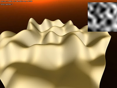
Generating random numbers this way, something like this is gotten:


This looks okay, but the interpolations are not very smooth and looks quite ugly. This can be fixed by using a better kind of interpolation. One way to to do this is using cosine-interpolation, which smoothen the transition a bit.

This looks a lot better, but the height map image still looks a bit angular, and not that smooth. However, we can smooth it even further by using cubic interpolation. This ties nicely into the image magnification analogy I made early as cubic is a common type of filter for that. It works by not only taking into account the two points to blend between, but the points next to them as well. In our above example this would be the points 4 and 7 (which are next to 5 and 6). It looks like this:


This gives a much smoother appearance, but it (as well as the other algorithms above) has some other problems. Because the height values for each whole pixel are completely random, it is gives a very chaotic impression. Many times one wants a more uniform look instead. To fix this something called Perlin noise is used. What makes this algorithm extra nice is that it based on gradients instead of absolute values for each pixel. Each whole pixel is assumed to have the value 0, and then a gradient determines how the value changes between it and a neighboring pixel. This allows it to be much more uniform look:


Because of it is based on gradients, it also makes it possible to take the derivative of it, which can be used to generate normal maps (something I am not using though). It is also quite fast, pretty much identical to the cosine interpolation. The cubic interpolation, which requires more random samples, is almost twice as slow.


Fractals
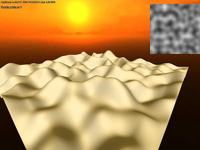
Now that a coherent noise function is implemented it can be used to generate some terrain. The screens above does not look that realistic though and to improve the look something called Fractal Brownian Motion can be used. This is a really simple technique and works, like all fractals, by iterating an algorithm over and over. What is iterated is the noise function, starting off with a large distance between the whole pixel inputs (low frequency) and then using smaller and smaller distances (higher frequency) for each iteration. The higher the frequency the smaller the influence, resulting in the low frequency noise creating the large scale features and the high frequency creating the details.

The result of doing so can produce something like this:


Suddenly we get something that looks a lot more like real terrain!

There is lots of stuff that can be done with this and often very simple alteration can lead to interesting results. Here is some iterated fractal noise that as been combined with a sine-function afterwards:


End notes
There is a lot more fun stuff that can be done using noise and I have just scratched the surface with this. It is a really versatile method with tons of usages for graphics. The problem is that that it can be quite slow though and my implementation will not be used for any real-time effects. However, Perlin noise can be simulated on the GPU, allowing it for realtime usage, and this is something I might look into later.

Next up is the hardest part of the terrain rendering - texturing! I am actually still not sure how to do it, but have tons of ideas. Can never get enough of info though, so if anybody know any good papers on terrain texturing, please share!


Thursday, 4 November 2010

Tech Feature: Terrain geometry

Introduction
The past two weeks I have been working on terrain, and for two months or so before that I have (at irregular intervals) been researching and planning this work. Now finally the geometry-generation part of the terrain code is as good as completed.

The first thing I had to decide was what kind of technique to use. There are tons of ways to deal with terrain and a lot of papers/literature on it. I have some ideas on what the super secret project will need in terms of terrain, but still wanted to to keep it as open as possible so that the tech I made now would not become unusable later on. Because of this I needed to use something that felt customizable and scalable, and be able to fit the needs that might arise in the future.

Generating vertices
What I decided on was a an updated version of geomipmapping. My main resources was the original paper from 2000 (found here) and the terrain paper for the Frostbite Engine that power Battlefield: Bad Company (see presentation here). Basically, the approach works by having a heightmap of the terrain and then generate all geometry on the GPU. This limits the game to Shader Model 3 cards (for NVIDIA at least, ATI only has it in Shader model 4 cards in OpenGL) as the height map texture needs to be accessed in the vertex shader. This means fewer cards will be able to play the game, but since we will not release until 2 years or so from now that should not be much of a problem. Also, it would be possible to add a version that precomputes the geometry if it was really needed.

The good thing about doing geomipmapping on the GPUis that it is very easy to vary the amount of detail used and it saves a lot of memory (the heightmap takes about about a 1/10 of what the vertex data does). Before I go into the geomipmapping algorithm, I will first discuss how to generate the actual data. Basically, what you do is render one or several vertex grids that read from the heightmap and then offset the y-coordinate for each vertex. The normal is also generated by taking four height samples around current heightmap texel. Here is what it looks in in the G-buffer when normal and depth are generated from a heightmap (which is also included in the image):


Since I spent some time with figuring out normal generation algorithm, here is some explaination on that. The basic algorithm is as follows:

h0 = height(x+1, z);
h1 = height(x-1, z);
h2 = height(x, z+1);
h3 = height(x, z+1);
normal = normalize(h1-h0, 2 * height_texel_ratio, h3-h2);


What happens here is that the slope is calculated along the x-axis and then z-axis. Slope is defined by:
dx= (h1-h0) / (x1-x0)
or put in words, the difference in height divided by the difference in length. But since the distance is always 2 units for both the x and z, slope we can skip this division and simply just go with the difference in height. Now for the y-part, which we wants to be 1 when both slopes are 0 and then gradually lower as the other slopes get higher. For this algorithm we set it to 2 though since we want to get the rid of the division with 2 (which means multiplying all axes by 2). But a problem remains, and that is that actual height value is not always in the same units as the heightmap texels spacing. To fix this, we need to add a multiplier to the y-axis, which is calculated like this:

height_texel_ratio =
max_height / unit_size


I save the heightmap in a normalized form, which means all values are between 1-0, and max_height is what each value is multiplied with when calculating the vertex y-value. The unitsize variable is what a texel represent in world space.

This algorithm is not that exact as it does not not take into account the diagonal slopes and such. It works pretty nice though and gives nice results. Here is how it looks when it is shaded:


Note that here are some bumpy surfaces at the base the hills. The is because of precision issues in the heightmap I was using (only used 8bits in the first tests) and is something I will get back to.


Geomipmapping
The basic algorithm is pretty simple and is basically that the longer a part of the terrain is from the camera, the less vertices are used the render it. This works by having a single grid mesh, called patch, that is drawn many times, each time reperesenting a different part of the terrain. When a terrain patch is near the camera, there is a 1:1 vertex-to-texel coverage ratio, meaning that the grid covers a small part of the terrain in the highest possible resolution. Then as patches gets further away, the ratio gets smaller, and and grid covers a greater area but fewer vertices. So for really far away parts of the environment the ratio might be something like 1:128. The idea is that because the part is so far off the details are not visible anyway and each ratio can be a called a LOD-level.

The way this works internally is that a quadtree represent different the different LOD-levels. The engine then traverse this tree and if a node is found beyond a certain distance from the camera then it is picked. The lowest level nodes, with the smallest vertex-to-pixel ratio, are always picked if no other parent node meet the distance requirement. In this fashion the world is built up each frame.

The problem is now to determine what distance that a certain LOD-level is usable from and the original paper has some equations on how to do this. This is based on the change in the height of the details, but I skipped having such calculations and just let it be user set instead. This is how it looks in action:

White (grey) areas represent a 1:1 ratio, red 1:2 and green 1:4. Now a problem emerges when using grids of different levels next to one another: You get t-junctions where the grids meet (because where the 1:1 patch has two grid quads, the 2:1 has only one) , resulting in visible seams. The fix this, there needs to be special grid pieces in the intersections that create a better transition. The pieces look like this (for a 4x4 grid patch):

While there are 16 border permutations in total, only 9 are needed because of how the patches are generated from the quadtree. The same vertex buffer is used for all of these types of patches, and only the index buffer is changed, saving some storage and speeding up rendering a bit (no switch of vertex buffer needed).

The problem is now that there must be a maximum of 1 in level difference between patches. To make sure of this the distance checked, which I talked about earlier, needs to take this into account. This distance is calculated by taking the minimum distance from the previous level (0 for lowest ratio) and add the diagonal of the AABB (where height is max height) from the previous level.


Improving precision
As mentioned before, I used a 8bit texture for height for the early tests. This gives pretty lousy precision so I needed to generate one with higher bit depth. Also, older cards must use a 32bit float shader in the vertex shader, so having this was crucial in several ways. To get hold of this texture I used the demo version of GeoControl and generated a 32bit heightmap in a raw uncompressed format. Loading that into the code I already had gave me this pretty picture:

To test how the algorithm worked with larger draw distances, I scaled up the terrain to cover 1x1 km and added some fog:

The sky texture is not very fitting. But I think this shows that the algorithm worked quite well. Also note that I did no tweaking of the LOD-level distances or patch size, so it just changes LOD level as soon as possible and probably renders more polygons because of the patch size.

Next up I tried to pack the heightmap a bit since I did not want it to take up too much disk space. Instead of writing some kind of custom algorithm, I went the easy route and packed the height data in the same manner as I do with depth in the renderer's G-buffer. The formula for this is:

r = height*256

g = fraction(r)*256
b = fraction(g)*256


This packs the normalized height value into three bit color channels. This 24 bit data gives pretty much all the accuracy needed and for further disk compression I also saved it as png (which has non-lossy compression). It makes the heightmap data 50% smaller on disk and it looks the same in game when unpacked:

I also tried to pack it as 16 bit, only using R and B channel, which also looked fine. However when I tried saving the 24bit packed data as a jpeg (which uses lossy compresion) the result was less than nice:


Final thoughts
There is a few bits left to fix on the geometry. For example, there is some popping when changing LOD levels and this might be lessened by using a gradual change instead. I first want to see how this looks in game though before getting into that. Some pre-processing could also be used to mark patches of terrain that never need the LOD with highest detail and so on. Using hardware tesselation would also be interesting to try out and it should help add surfaces much smoother when close up.

These are things I will try later on though as right now the focus is to get all the basics working. Next up will be some procedural content generation using perlin noise and that kind stuff!

And finally I willl leave you with a screen container terrain, water and ssao:


Friday, 29 October 2010

Halloween Tips. Sale and more!

Now that northern hemisphere people move into darker times what can be better than to indulge in some horror! Read along to get some tips on games, books and movies to check out this Halloween!


What to Play?
First of all we have to recommend our own creations that are now available at a very low rate! Amnesia and Penumbra can both be gotten for as low as 50% the price on several online stores. Right now discounts are available at Our Own Store, Steam, GamersGate, ImpulseDriven and the voices tell me Direct2Drive will have discount very soon too.

I would also like to put special attention on our newly launched Mobile Store. It is an ordinary internet store where you can buy the game by simply sending an SMS. It does not get much easier than that and is especially nice for anyone missing a credit card! All our games are on sale there too and if you are lucky they might cost you less than half the normal price! So do not hesitate and check it out now:
http://mobile.frictionalgames.com/

In case you have already played both Amnesia and Penumbra, here are some more more recommendations:

Anchorhead
A lovecraftian Interactive Fiction game with story similar to "Shadow of Innsmouth" and "The Case of Charles Dexter Ward". It is quite long and very well written and implemented. If you can manage playing without graphics this is a great choice.

Call of Cthulhu: Dark Corners of the Earth
Another lovecraft-game, but this time in glorious realtime 3D. Especially the first third of the game is deliciously creepy with a nice foreboding atmosphere. If you can stand a few bugs and cheap deaths, this game is well worth getting.

I have no mouth and I must scream
This is a game that is not that scary, but instead features some extremely disturbing themes. The story takes place in a post apocalyptic future, where the last five people on earth are being tortured by a not-so-friendly AI named AM. It plays like a usual point-and-click but with some fun twists. Unfortunately the game suffers from some annoying puzzle design, but is still worth trying out. And oh, the game works with ScummVM, and should thus run on just about any platform.


What to watch?
At Halloween all kinds of crappy horror movies are released, so to save you from that here are some films that you might have missed:

Fermat's Room
Five people are called to a puzzle evening which takes on a diabolical twist. If you enjoyed limited location based movies like Cube and (first) Saw, this is one is highly recommended!

Eden Lake
A story about a couple taking a trip to a lake is not all that original, but Eden Lake has a nice twist to it. Beware of some disturbing scenes.

Hard Candy
Cranking up the disturb-o-meter, this movie is unsettling to say the least. It starts out with a creepy meeting between a man and a young girl, and then gets progressively worse.

Day of the Beast
To lighten up after Hard candy, you should consider this movie. It is about a priest that in order to stop the anti-christ decides to become evil. He teams up with a mentally unstable death-metal fan to do so. Hilarity ensues.

Lost Highway
This is probably my favorite a Lynch movie, if only for an excellent scene involving a telephone at a party. It is not that scary, but keeps a brooding atmosphere throughout. Beware of weird lynchian plot!

Audition
Since we want to go out with a bang I am rounding up the list with this disturbing masterpiece. The movie is quite slow, but this only helps building to moments of true horror that it has. The end scene is unforgettable.


What to read?
Nothing can tingle the imagination as a good book. So here are some tips on how to invoke those nightmares I bet you long for.

Anything Lovecraft
A novel by the master of horror is a must! For people new to the man, I would recommend "The Whisperer in the Darkness", "The Shadow over Innsmouth" or "The Dunwhich horror", all very typical lovecraftian tales. All of his works is available online, but they are of course best enjoyed in front of the fireplace.

The Terror
A retelling of the doomed Franklin expedition with the addition of a stalking monster. Most of the book is based on true events, and the supernatural spice increase scariness in an already horrific story. This is probably one of the best horror books I have read. It takes a while to get into, but when you do the book will not let you go.

Perdido Street Station
I consider the books author, China Mieville, but be a kind of modern day Lovecraft. He has the same dense, but yet enthralling, prose and an incredible ability of making monsters. The books takes place in a fantasy world, but even though it is very weird, it feels in real in a way. Prepare for some really disturbing imagery.

Stiff: The Curious Lives of Human Cadavers
Ever wondered what happens to human bodies after they die? This book contains all you want to know and then some. It opens up with describing rows of heads lying in bowls (to be used in educational purpose) and then gets worse. For anybody interested for anybody interested in the macabre this is a must.


Your tips?
Please leave any nice Halloween tips you might have in the comments!


Friday, 22 October 2010

Pre-pass lighting redux

Introduction
After writing the previous post on pre-pass lighting I started doing some tests, to see how it compares to the old deferred renderer. The results that I got where pretty interesting, so thought I might as well share them. Also note that this post might be a bit more technical than the previous.

The good thing with these renderers is that they both share the basic material data. So I can use the same data for both HPl2 and HPl3. HPL3 comes with the few more features for decals but for tests, it is easy to just skip them. When setting up the test I went with a very simple scene, it just the same box model rendered several times, a floor and lights. Some times it is best to test with proper game scenes, but I wanted to something that could be easily tweaked and gave simpler output. This means that the tests are not 100% accurate of in-game performance, but even testing a level in game is not that, as framerate varies a lot depending on where in a level one looks. So usually benchmarking has some kind of fly-through, but that is of the scope from what I intended to do.

Note that HPl2 test was built in Visual Studio 2003, while HPL3 uses the 2010 version. I do not think this should matter much though, even if the optimization routines differ, simply because pretty much all of the work is done on the GPU. The graphics card I did all my testing on is a Radeon 5850 HD (and others where tried for some tests). And as a final note, all of the data is given as average frame time (in milliseconds!) and not as frames per second. As Emil Persson points out, FPS is not a very good way to compare performance.

Test #1
Now with my setup details out of the way, let's get down to the details. I first started out with a scene like this:
1 x box, xz-plane floor, 1x spot light + shadow
which game me the following results:
HPL2: 0.78ms
HPL3: 0.84ms
Difference: +7.7%
This means, that given a simple scene like this the old renderer is actually faster! This is not that strange though since the scene does not have many lit screen pixels, most of the image being sky. Thus, the extra pass extra made with the pre-pass renderer matters more than an lighting speed-ups. Also, the decrease in draw buffer (3 to 2) in the g-buffer does not make up for the extra pass.

Test #2
4000 x boxes, 1 x point light, x-z plane floor
HPL2: 14.9
HPL3: 18.5
Difference: +24%
As expected when there is a lot of things to render, the pre-pass lighting is even slower. That extra pass shows on the performance. Remember though that 4000 objects is quite much and an important thing for good performance on GPUs is to have as few draw calls as possible.


Test #3
1 x boxes, 1000 x point light, x-z plane floor
HPL2: 30.0
HPL3: 29.2
Difference: -2.7%
As noticed, once the scene is filled with lights, pre-pass lighting is faster, but only so by a slight amount. Especially considering the large amount of lights. (I later realised that the actual lit screen pixels where quite few, something fixed later on in test #5).


Test #4
4000 x boxes, 1000 x point light, x-z plane floor
HPL2: 47.5
HPL3: 52.0
Difference: +10%
Doing a really stressful test (the number of lights and objects are really large) it seems like the old deferred renderer wins out. This was actually a bit unexpected and dissappointing to me as I thought that the pre-pass lighting should not be this far behind. But taking the little difference in test 3 into account, it is not that suprising. Still, after these tests it is clearly shown that pre-pass lighting is far from a giant speed up compared to deferred shading and it actually seems slower in most cases.

I also tried to skip the early-z pass for pre-pass lighting (I use early-z in both renderers on all other tests). This is basically a pass where the z-buffer is set up, and makes sure later passes only draws visible pixels. From reading Crytech papers, it does not seem like the the Crysis 2 engine has this though (and same seems true for other engines), so I tried to do a quick and dirty test of not using it and got this data: 48.7 (+2.5%)
This means that even without the early z test, the pre-pass was still slower. However, I did not attempts to reduce overdraw (like sorting front to back) and it might be possible for optimizations here. However, when rendering front to back, there will be a lot more state switching as you cannot sort according to texture, etc as efficiently, so I wonder if the data might not even be worse in a more realistic scenario.

I also tried this test out on a few other other cards (again with full early-z testing):
Geforce 240gt: 125, 137 (+9.6%)
Geforce 320M: 240, 240 (+/- 0%)
This gave the indication that on some cards pre-pass might actually be better, and that it might not be as clear-cut as the first tests seemed to show.

As a final variation on this test, I added illumination maps to all textures, a feature that requires an extra pass in the old engine. I also removed the height map rendering. This gave me: 50.6, 50.0 (-1.2%)
This is a very tiny speed up considering that the methods now have the same amount of passes and that pre-pass lighting has faster light rendering and a smaller g-buffer.

Test #5
488 x boxes, 30 x point light, x-z plane floor
Radeon 5850 HD: 7.4, 7.8 (+5.4%)
Geforce 240gt: 18, 19 (+5.5%)
Geforce 320M: 50.0, 45.5 (-9%)
Geforce 9800gtx: 9.5, 9.5 (0%)

In this test I change to a more realistic number of lights and draw calls. I also aligned the lights so the lit pixels covered the entire screen, which I did not do above. As can be seen, on my computer (the 5850) deferred shading still wins, but on a less powerful card the pre-pass lighting is much faster. This difference might be a bandwidth issue and some cards might have problems pushing the data amounts required for deferred shading.

I also did a tweak to this test and turned down the number of draw calls a bit:
316x boxes, 30 x point light, x-z plane floor
Giving: 6.4, 6.6 (+3%)
This further reduced the difference and if I did the hackish removal of early z, pre-pass lighting plunged down to: 5,2 (-18%)
Even though this removal of early z is not very realistic, the results show that I need to investigate it. Something I will do once I get a more proper scene up and running.

Finally, I also tried to give all the boxes illumination (and turning back on early z test):
6.8, 6.6 (-2.9%)
This clearly shows how you get the illumination almost for free in pre-pass, and that it costs a bit more with the deferred shader. This is not surprising though, given that it requires an extra pass, but hints that further effects can be more efficiently implemented when using pre-pass lighting.


Conclusions
The tests clearly show that my previous assumption that light rendering in pre-pass lighting would be much faster was incorrect. It is a bit faster, but only noticeable so when really stretching the limit and then only by a small fraction. This makes me conclude that one should not use pre-pass lighting to have faster light rendering. However, as can be seen on the test with the Geforce 320M, the pre-pass lighting technique matters a lot more on older hardware, and it might actually be of greater use there.

There is not any vast differences in the techniques though and instead the choice should be based on other merits. Given that pre-pass lighting allows for so much more variety in materials, I will keep it for HPL3, but I will not be expecting any rises in framerate anymore.

I hope this post will prove useful for those who are thinking of using either rendering method, and for the rest it might be an interesting insight on how testing is done (at least how I do it). Again, sorry for the lack of pretty picture, which I promise to make up for!


Thursday, 21 October 2010

Tech Feature: Pre-pass lighting

Progress on the new engine, HPL3, is coming along nicely and recently I changed the core rendering system into something called Pre-pass lighting. This switch has been made for a number of reasons, but before I got into that and what pre-pass lighting exactly is, I need to explain how we did it back in the "old days".

Forward Rendering
The engine powering Penumbra (HPL1) uses something called forward rendering. This type of rendering works by rendering the entire scene on an object basis. So when rendering a chair, wall, or any geometry in the world, this was done by drawing it one time for every light that touches it. So an object that is lit by three lights has to be drawn three times, and so on. This technique can be quite limiting when setting up scenes as you need to be very careful when adding lights. It might not actually be clear exactly how much impact on performance a single light will have and levels usually require quite some tweaking to get right. The complexity of a scene can be expressed as:

Draw calls = Objects * Lights


This means that the number of draw calls can easily get very large and only adding a single light, even if it has little effect on the scene visually, can have very negative effects on performance.

Deferred Shading
When starting work on HPL2 (which was used for Amnesia) I wanted to get away from this annoying light limitations. Since HPL1 had been created a new technique called "Deferred shading" had emerged and when work on HPl2 was started, the average PC system was up for the the task.

What makes deferred shading special is that it separates rendering objects and rendering the lighting. This works by first rendering to a special G-buffer that contains information such as normals, depth and color of all on screen objects. The final output looks like this:


From left to right: Color, normals and depth. Note that these texture have 4 channels each and not visible are also saved specular intensity and power. These three texture then represent the properties of all visible data. It is then used by the lights to render the final image. This makes the complexity of the rendering:

Draw calls = Objects + Lights

This is a lot nicer and as lights and objects are separated, it is a lot easier to add lights to a scene without worrying about performance hits. It is also much simpler to intuitively understand how performance will be affected. By using this technique we where able to use a lot more light sources in Amnesia and considering all of the dynamic lights needed for the mechanics, the game would have been a lot harder to make using forward rendering.

Deferred rendering is not without problems though. First of all, rendering the G-buffer means rendering to three textures at one time which is quite performance heavy, meaning a scene with few lights runs faster on a forward renderer. Secondly, there is no support for fullscreen anti-aliasing either, and one has to do some hackish tricks to remove jagged edges (the "edge smooth" feature in Amnesia). Finally, there is much less material variety possible as every property needed to generate the final image needs to be in the G-buffer. Since we could mange without fancy skin shaders in Amnesia, it was turned out to not be too much of a problem though.

Scenes like the test of Agrippa above would not be possible in our old Renderer. In this test shot around 30 lights help light Agrippa in a nice fashion, and since the geometry and lighting is decoupled it is possible to run this with a high framerate.


Pre-pass lighting
I heard about this technique (first saw it here) during the development of Amnesia and was a bit interested in trying it out. I was interested in the tech back then since it made light rendering go faster, something that had proved a bit of a bottle neck in Amnesia. However, I did not have time back then and decided against it.

As I started to update the engine to HPL3 I again looked at this technology. This time more had been written on the subject and it had actually been tested. For example a similar algorithm was used in Insomniac's Reistance 2 and Crytech goes over it in a paper about CryEngine 2. This also meant that the method was practical, and was well worth trying (I usually try and use tech I have been able to try in other games, as tech dead-ends can prove quite expensive).

Pre-pass lighting (or deferred lighting as it is called sometimes) is very similar to deferred shading and I could use much of the code from HPl2 when implementing it. Only a few changes in materials and light rendering was really needed. The rendering works by also first rendering to a G-buffer, but one only containing normal, depth and specular power. After that lights are rendered, but they render only part of the light equation; basically color and specular intensity. Then in a final pass all objects are rendered again and the light data from the previous pass is used to render the final image. The sequence is like this:

Render Normals+Depth -> Render Lights -> Render final image


The first good thing is that this technique is able to render lights faster, since each lights has to do less equations and access less textures. The algorithm also includes an extra step at the end, but this does not matter that much, as the added the final render takes is regained by the one less buffer needed to be rendered to in the first g-buffer pass (only 2 textures needed instead of the 3 deferred shading uses).

This speed up was not the main reason why I used it though. Since each object rendered again during the final pass, it is possible to have a much larger variety of material types. Instead of being confined to using what can be fitted into a g-buffer, a material can do specific calculations the final image pass. This allows for specialized skin shaders and other tricks. For example, it is now possible to have more features packed into the decal materials:

Above is a decal with both color, normalmap and height map, something not possible in the previous engine. (Note that color and normal have separate alpha and that the height map make the tiles seem carved out of the ground).


End notes
Now I have given a little rundown of how the new renderer works and how it differs from the old one. I have skipped a lot of the details and more technical stuff, to make the post a bit shorter. So if you have any questions, comment and I might have some kind of answer!

Also, sorry for the lack of new and exciting images in this post. Next tech feature should be more fun on that part, as I am now moving on to Terrain...

EDIT:
I eventually did some tests on the algorithm and compared it to the old renderer. Results are:
http://frictionalgames.blogspot.com/2010/10/pre-pass-lighting-redux.html